Google first introduced the concept of “live wallpaper” on Android on version 2.1 back in 2009. It was a cute idea, but didn’t work especially well. Back then, the “live” part of the wallpapers often required that you touch them. There are already plenty of other touch points on a phone, so adding that in was not especially useful.
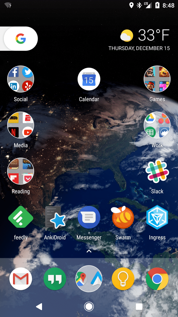
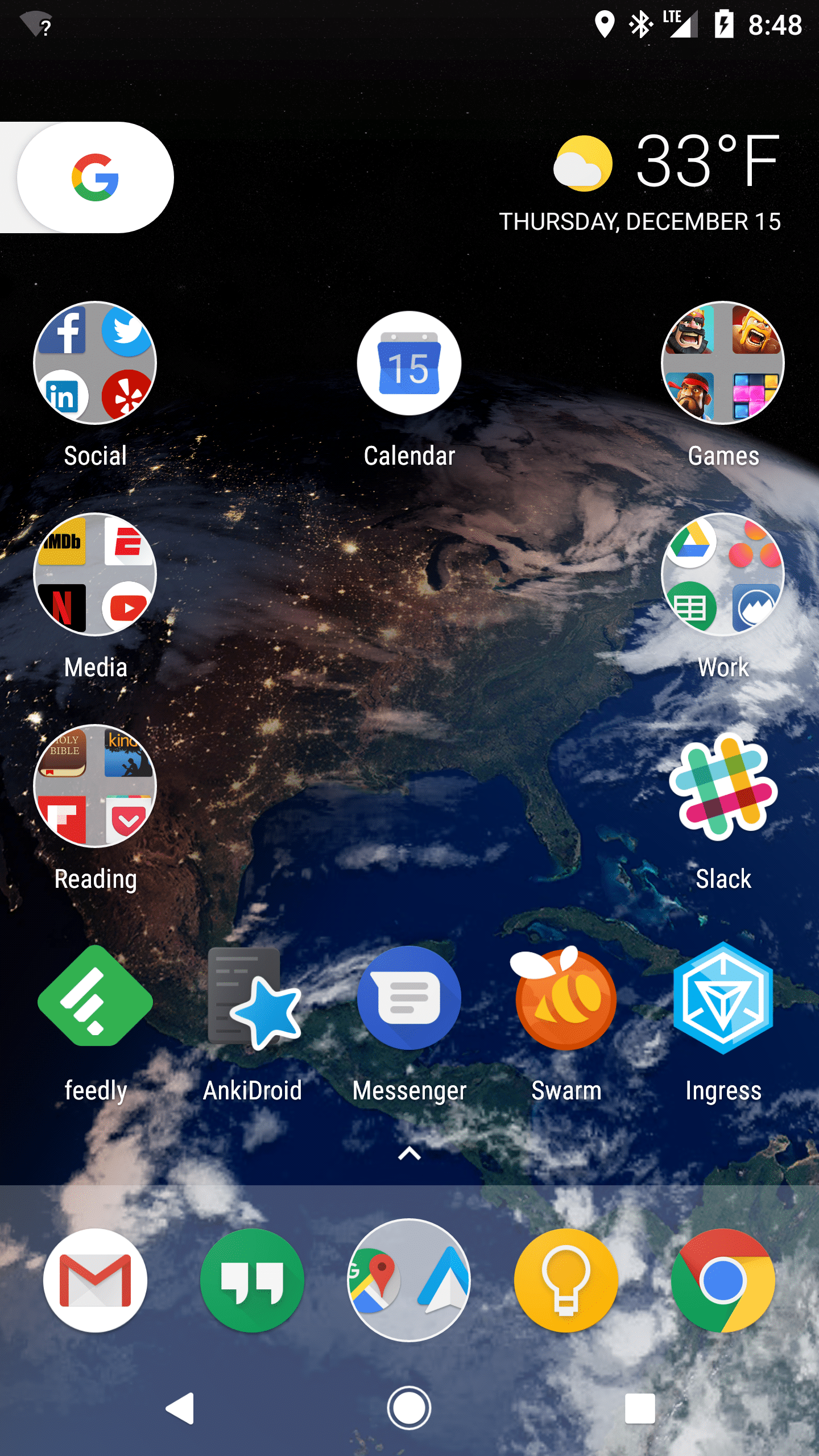
With the release of the new Pixel phone, Google has re-imagined the concept of live wallpapers and it’s quite impressive. For example, here is my current wallpaper:

It looks like a neat shot of the earth, and it is, but it’s so much more interesting than that.
Location:
First, it’s centered on my current location on the globe.
Movement: When you log in or swipe between screens, it has a very subtle zooming effect.
Real-time sun and lighting:
I took this image at 8:48am EST. You can see the east coast of the US is light, while the central and west part of the country are still dark with (fake) city lights glowing.
Real-time clouds: All of the clouds are updated in real-time from satellite imagery.
At the end of the day this is just wallpaper, and not really a big deal. However, it shows that Google is working hard to make every piece of this phone a premium experience. They worked with the design agency B-Reel to come up with these, and this post on the B-Reel site digs deeper into some of the unique wallpaper features that they came up with.
I tend not to care too much about Android wallpaper, but I’ll admit that these have been fun to play with and add just a little extra fun-factor to the phone.


Nice article