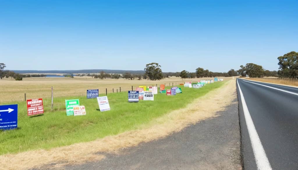
Whenever you’re in the car, I’m sure you see many of the same things as you’re driving — signs on the side of the road (or up on billboards) promoting one business or another. Many of them are illegal “bandit signs”, but this isn’t about the legality of them (though I hate those), but more about the effectiveness of them.

In most cases, the signs include a phone number and a variety of info about the business. If I’m driving, there is a 0% chance I can write down or remember the phone number. If I’m a passenger, by the time I read the sign and maybe decide it’s of interest, it’s too late for me to read and save the phone number.
You might figure “it can’t hurt to include the number”, but it can. Including the phone number requires that you make the other words smaller, when size and clarity matter a ton. We recently had some electrical work done, and they asked if they could leave a sign in our yard. We agreed, but the sign wasn’t great. It had their name and their logo, a big Google logo to promote their ratings, and then a phone number.
My wife, who was fully aware that they had been at our house, asked me why we had a Google sign in our front yard because she didn’t even realize who it was really for. If they had just put their name on it in block print it would have been way more effective.
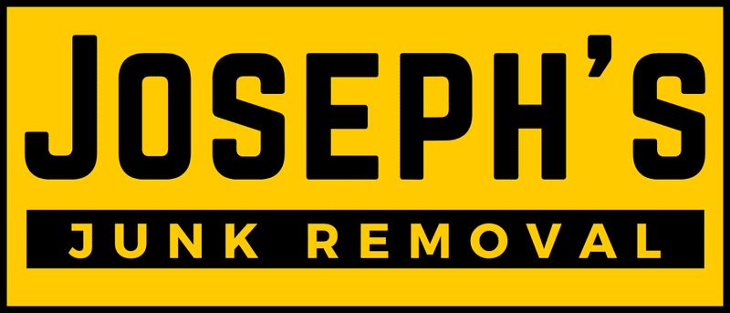
A great example that’s local to us is Joseph’s Junk Removal. I’ve never used them (though they have a solid reputation), but their name is easy for me to remember because this is how their signs look:

I’ve seen bandit signs with it, billboards with it, and a variety of other places and they’re always just that simple. No phone number, no web URL, just a clear call of who they are and what they do.
There may be places where a phone number is essential, but most times you’d be better off following the example of Joseph and just keep it clean and super clear.


