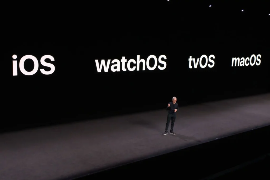
Over the years, I’ve tried to make the slides for talks that I give have fewer and fewer words on them. Generally speaking, that’s a good thing to do. For example, here is a slide from a typical Apple presentation:

Or Google:

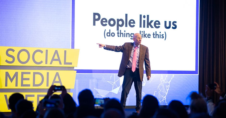
Or someone like Seth Godin:

Funny enough, one of Seth’s talking points about presentations is: “No more than six words on a slide. Ever. There is no presentation so complex that this rule needs to be broken“. I didn’t intend to, but the example I used for him above has 10 words on it. 🙂
Reinforcement via slides
Slides are intended to reinforce the point you’re trying to make, not to explain it all. In the book “Outsmart Your Brain“, author Daniel Willingham shares this as well:
On the subject of slides, remember that listeners will likely write whatever is on a slide, probably verbatim. They use “presence on a slide” as a rough measure of importance. Generally, that should mean that you put less text on slides in an effort to get your listeners thinking more and copying less. But if you want them to write something word for word—a definition, for example—put it on a slide.
If you put words on a slide, especially in an educational context, people will write them down. As Willingham says, less text will mean less straight copying and hopefully more thinking from your audience.
In virtually every presentation, that should be the goal. If you put it on the slide, they’ll write it down, so use that to your advantage in both directions.


