I posted a few years ago on the GreenMellen blog about sites that have links automatically open in new windows, and how that wasn’t always the best move.
The logic I hear is “if you’re taking them to a new site, have it open in a new tab so that they don’t leave your site”. That almost kinda makes sense, and is worth doing sometimes, but making it a hard rule is asking for a bad experience for your users.
State Bank
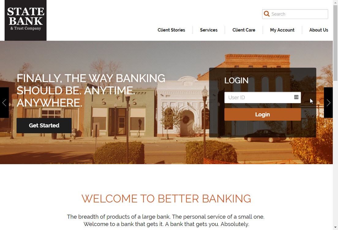
A great example is State Bank. We moved most of our banking over to them from SunTrust a few years ago and have been very pleased. However, they just redesigned their home page and did something very silly. Here’s how it looks:

You type in your User ID, click “Login”, and it opens a new tab for you to enter your password. Why? Because it’s going to a “different site” (in this case, a branded netteller.com page). Now, every time I log in I need to click the button, go to the new tab, then close the old tab, then finish logging in. It’s not a huge deal, but it’s getting old very quickly.
I emailed them about this, and got a pitiful response:
State Bank apologizes how the new look of our web page may be a little confusing when in use.
I’m not “confused” by it; it’s simply bad user experience on their end. That’s the kind of garbage I expect from SunTrust, not from a smaller bank like them. While I’m picking on State Bank for this, they’re far from alone. Others I deal with often that do this same trick include Ford Credit, Cobb County Water and Cobb EMC.
There are certainly times when having content open in a new tab is a good move, particularly for items such as PDFs. The problem is that most companies look at it from a selfish perspective “making sure users don’t leave the site”, even if that makes for a poor user experience.
Always do what’s best for your visitors and you’ll find yourself coming out on top.


