Snip-its is a cute place to take a young child for a haircut. They have lots of bright furniture, TV screens, games, etc. However, the store (and the entire company) seems to be falling apart quickly.
It started when we pulled up their website. Are those AdSense ads on the bottom? I certainly have no problem with a site using them, but this just seems tacky and desperate for a consumer business site. Still, no biggie.
We arrived, and found the TV broken, just like it’s been for the last year or so. Lovely.
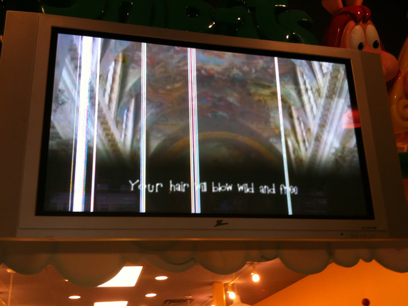
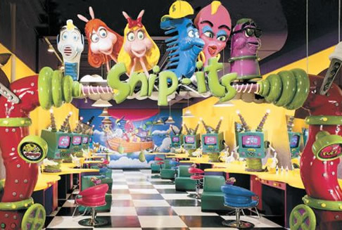
Not exactly the pretty happy-land they show on their site:
Still, that’s not the point of this post. What shocked me was the number of signs around the store that said “DO NOT” do various things like play with toys, climb on the chairs, touch the giant red tree, etc — things that you’d expect all of your “customers” to try and do! Apparently the stores were designed very poorly or something, because this apparently is a huge problem. I’m quite sure Seth Godin‘s head would have exploded in a place like this. Here’s a sampling of some of the signs. Most were repeated all throughout the store — I was trying not to make a scene while taking the pictures, so I only grabbed a few:
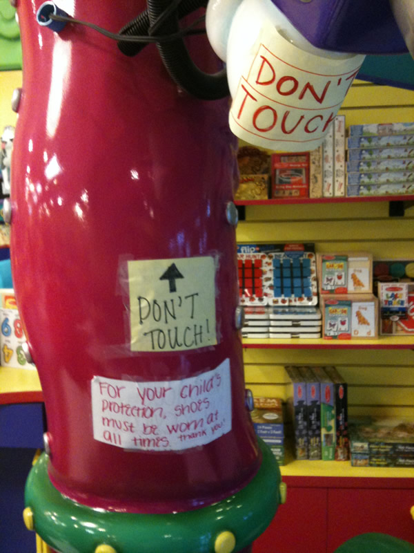
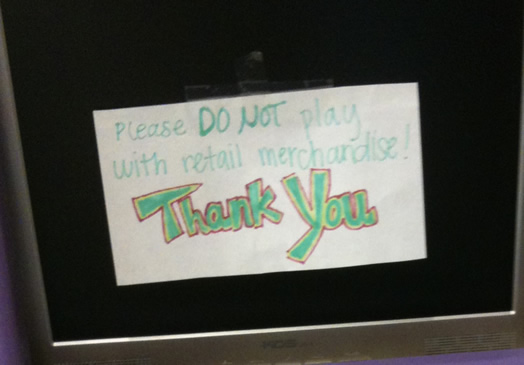
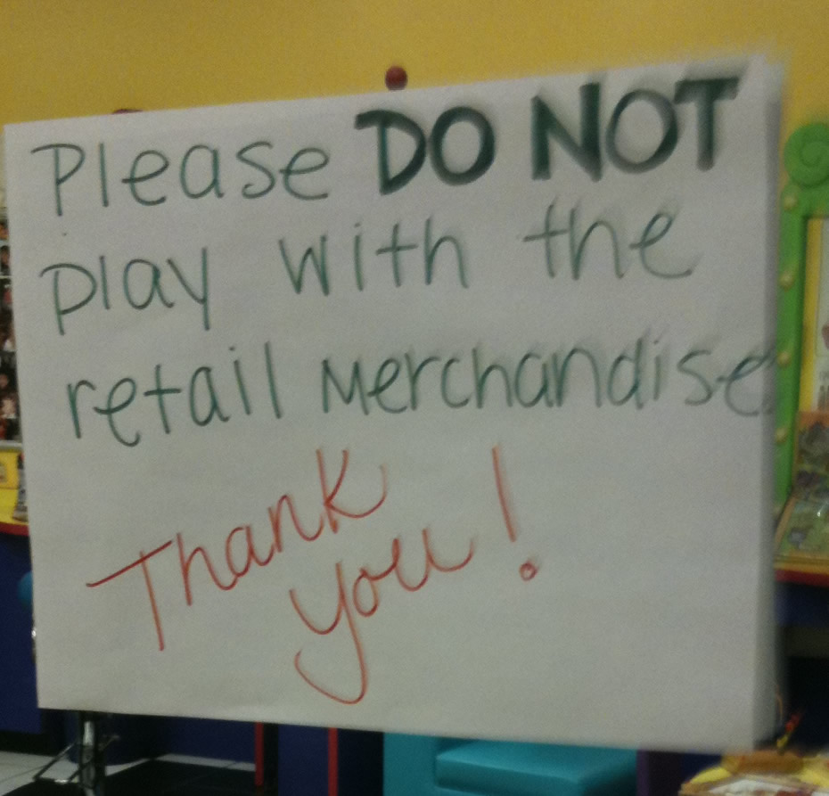
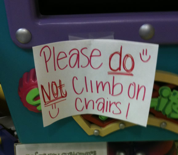
It was staggering. The store was littered with these signs. This last one isn’t too bad, but by the time we left I was sick of seeing lists of what we couldn’t do, and this stuck out more than usual:
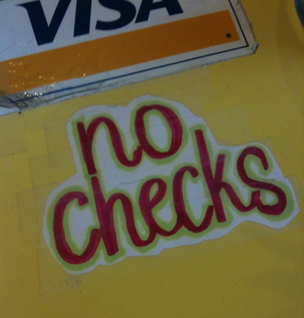
Wow. It was amazing. I’ve seen examples of stores with long “do not” lists before, but I’ve never witnessed one this bad. What’s the worst that you’ve seen recently?


