You might be tempted to use some fancy technology for your navigation. While that’s not necessarily a problem, you need to test your site in various browsers (with various settings) to see what people might come across.
According to recent stats, around 10% of users don’t have Java enabled (many turn it off for extra security) and about 8% of users don’t have Flash. If you think they’ll install new plug-ins just to browse your site, you’re pretty cocky – and probably wrong.
The biggest problem that can occur is that users that are missing a certain plug-in won’t be able to browse your site! It’s one thing if they miss a cool animation about your Easter service, but it’s big trouble if they can’t even use the site.
In many cases, you can’t make your cool navigation work with all browsers, and that’s ok. If that’s the case, just add text links to the very bottom of every page that has a link to each of your primary areas of the site. That way you can leave the cool navigation but still have a useable site for the people with less-enabled browsers.
Also, make sure every item in your navigation bar is clickable. I’ve found a number of sites that have cool drop-downs, but won’t let you click the main item. If you have a “Ministries” button that has a drop-down list of ministries, I should be able to click the main Ministries button to get a text list on the next page.
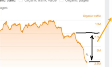
Finally, always remember that Google “browses” without Java or Flash. If you can’t get around your site without those technologies, neither can Google. Having those text links at the bottom of the page will enable Google to find all of your content, which will result in more traffic on the site and (hopefully) more traffic at your church!
Mickey


