Liberty Hill Church in Canton, GA is an awesome church. I’ve visited for worship a few times, and they are top notch — great preaching and excellent music. If you happen to live in the area, I highly recommend you check them out. However, they’ve done something with their website that I think is a bit mis-guided.
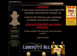
 They’ll probably change it soon, so I’ve put a screenshot on the right. The have put some text on the top of their site in huge letters. It reads:
WARNING! If you have received on overnight UPS package showing the shipper as iberty Hill Church your package contains counterfeit checks. Liberty Hill DID NOT send these packages!
It takes up most of the space above the fold on the home page. I can appreciate that this appears to be a major problem and they need to alert their congregation. However, there are better ways to do this:
- E-mail everyone. I’m sure they have e-mail addresses for most of the congregation.
- Call those that you couldn’t e-mail.
- Put it on the site in an obvious, but less-intrusive location.
- Announce it on Sunday mornings.
Text like this, especially in this location and size, is likely to scare off any first-time visitors to the site. It’s a not brand-new situation, either. The Google cache from a week ago shows it there, and it may have been up before then. You have just a few seconds to tell a new user your primary message, and this is what you want to say?
A few other small notes:
- Part of the text is underlined, but isn’t linked. I fully expected to be able to click on it. Never underline text unless it’s a link.
- The “under construction” graphic is cute, but should never be used. I realize there’s a new site coming, but you still have a content-rich site here. Make it as good as you can until the new one is ready, then switch over. A small “Get ready for the new site!” graphic would be fine, but the big “under construction” isn’t necessary.
The result of the “ZOMG!!!!!!!1111” warning and the huge “under construction” pic means that the main content is way down on the front page — about 1100 pixels by my count. That’s nearly two screens for a lot of users.
Liberty Hill Church is everything they claim at the bottom — God-seeking, Jesus-focused, Bible Based, etc. They just need to make sure and tell people that message.


