Between our business mail service and returning Amazon orders, I visit our local UPS Store quite a lot. They’re great!
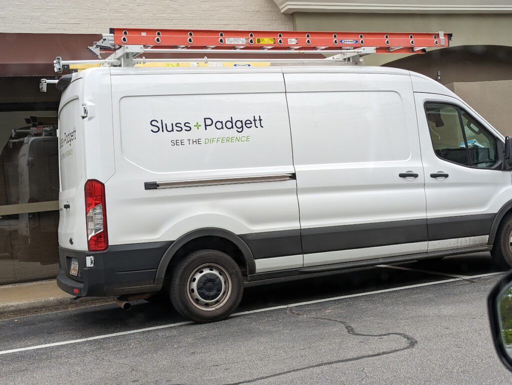
A few doors down from them I often see a few trucks for Sluss+Padgett, a company that does… something? Here are their trucks:

I appreciate a nice clean design, but their “See the difference” tagline brings me 0% closer to having any idea what they do. The ladder indicates likely some kind of construction, but it’s not clear at all.
I’m sure they thought long and hard about that tagline, but they went for “short and clever” over clarity. I still love Blake Howard’s quote that “It’s a mistake to sacrifice clarity on the altar of distinction“, which is exactly what happened here.
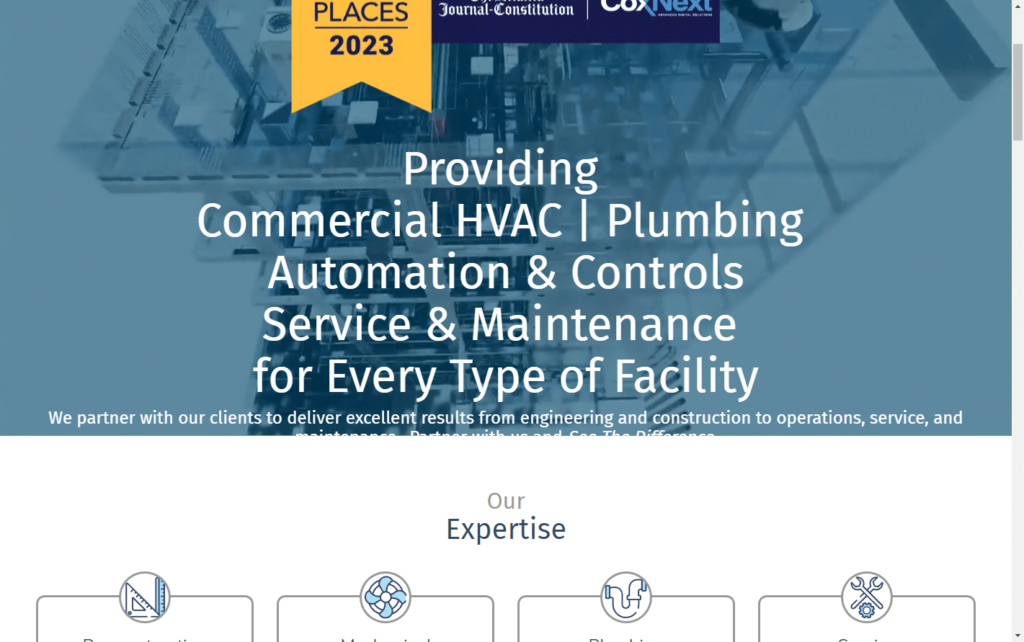
For the purpose of writing this post, I snapped that photo above and then dug into their website a bit. While the website helps, clarity is still lacking as it takes a lot of words for them to try to explain what they do. It varies a bit depending on screen size, but they have so much text in their main headline that it cuts off on my screen:

This post isn’t intended to pick on Sluss+Padgett specifically, as they may be a great company. However, they’re likely missing great opportunities to be a bit more well-known in the area if they’d just focus a bit more on “clear” over “cute”.
Despite driving past their trucks for months, if someone had asked me if I knew of a good commercial HVAC company I would have never thought of them, because I had no clue that’s what they do.
Clarity always wins.


