If you were to pull your chest of drawers out from the wall and look at the back of it, what would you see? In most cases, it’s just a piece of plywood or even some heavy cardboard. That’s not necessary bad (cost savings, etc), but it speaks to the quality of the design.
Steve Jobs put it this way, as told by Michael Schrage in an article on Design Intelligence:
When you’re a carpenter making a beautiful chest of drawers, you’re not going to use a piece of plywood on the back, even though it faces the wall and nobody will ever see it. You’ll know it’s there, so you’re going to use a beautiful piece of wood on the back. For you to sleep well at night, the aesthetic, the quality, has to be carried all the way through.
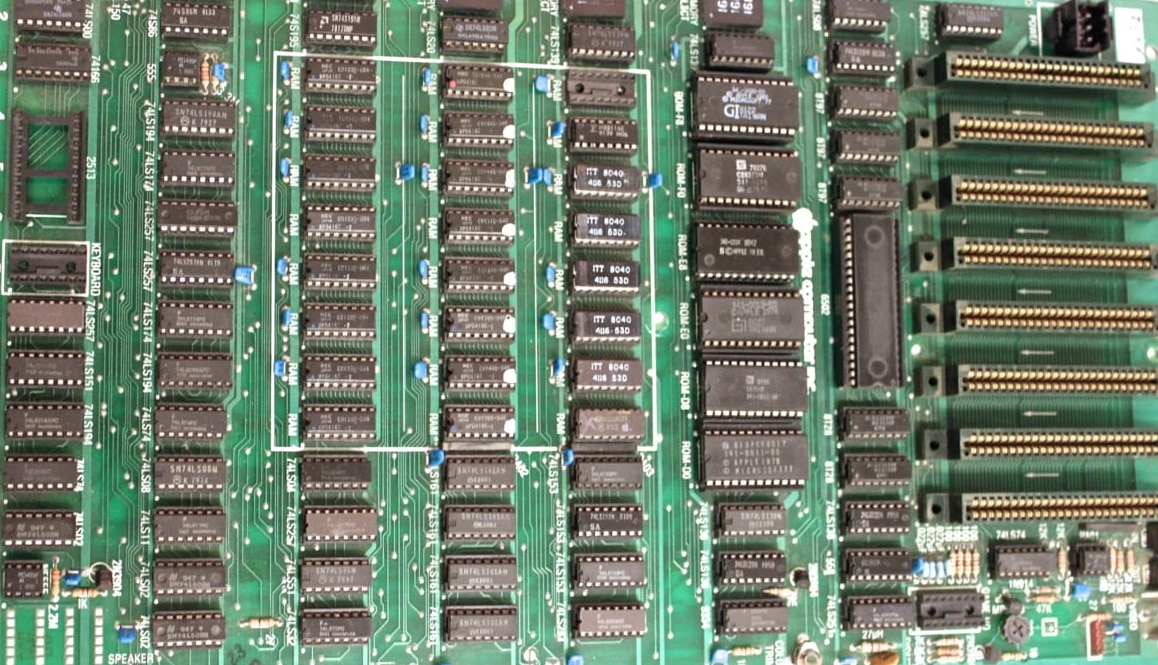
Jobs made sure Apple followed a similar philosophy. In the early days of Apple, he insisted that the chips on the motherboard of the Apple II and the original Macintosh be perfectly lined up. His team protested with things like “Nobody is going to see the PC board”, but he insisted. He wanted his products to be beautiful both inside and out.

(fun side note — the device you’re on right now has roughly 4,000,000 times more memory than the Apple II motherboard pictured above)
I don’t think Jobs’ philosophy fits in every situation, but it depends on your goals. If you want to make something truly amazing and beautiful, don’t be afraid to go all the way with it.


