Creativity can be a double-edged sword. While it’s often a very good thing, if used excessively or carelessly it can lead to trouble. As David Ogilvy has said:
“When I write an advertisement, I don’t want you to tell me that you find it ‘creative.’ I want you to find it so interesting that you buy the product.”
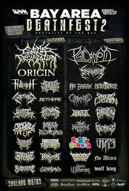
This came up when I saw the “Bay Area Deathfest” promotion (a death metal festival in San Francisco). All death metal bands have almost indistinguishable logos; as Creative Bloq says, “Generally, they’re a veritable smorgasbord of tattoo-ready spikes and gothic typography – the harder to read, the better.“.
I said “all of the bands”, but there was one exception that you might notice…

While being creative for creativity’s sake can be bad, there are times when a bit of “let’s just try to stand out” can be a good thing. As user “JosebaZilarte” mentioned on Reddit, “For a music genre that presents itself as subversive, there is a lot of conformism.“
It seems to me that pretty much every death metal band has found a logo designer and said “we need a logo that looks like this”, and they all got it. It’s generally important to stay close to your genre so that you can be easily identified, but when that goes too far it leaves a great opportunity for someone else to stand out.


