You see it all the time. Browse on someone’s website and you’ll see “Designed by xxxx” or something similar at the bottom. I don’t do that. Why? Simple: it’s bad for your business.
My main goal is to help you succeed.
By adding a link to the footer of your site, companies help themselves at your expense and are acting naively, greedily or are simply short-sighted.
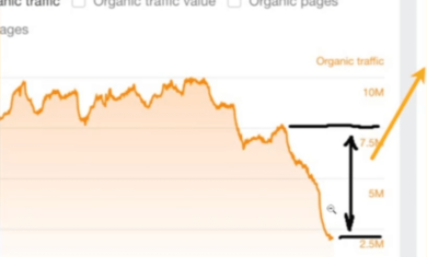
One of the best things I do for my clients is to help them rank well in Google. As a whole, my clients receive over 250,000 visitors each month from Google, and it’s not from any secret trick — it’s just a lot of small pieces that add up to help everyone succeed. One of those pieces is a lack of unnecessary links on your site to leak your “link juice”.
Pretend for a minute that your home page has 12 units of “link juice” (which is what we’ll use to show the imaginary level of value Google has placed on your site). You can use those 12 units any way you want. If you have two links on your home page, each link would get 6 units and those pages would benefit from that by ranking well in Google for their own search terms. If I toss my link in the footer, then suddenly your 12 units are split three ways, and your other pages only get 4 units each. That’s not a big deal for a single page, but think about that happening on every page of your site. By the time Google works its way through your dozens of pages, you’ll have lost so much juice to our silly footer link that it’ll make for a noticeable hit on your bottom line.
Again, this is just a small piece of the big picture. I also work hard to build your navigation in such a way that Google likes it, make sure your title and header tags are in place, and many other tiny tweaks. Added up, those things will help put you at the top of Google and bring extra customers to your business.


[…] Also in the footer is the “designed by” garbage. Don’t leave that on there. […]